RBL Bank · 0→1 Product Design · 2022

When money is involved,
trust becomes the product.

RBL Bank wanted to launch its first UPI-powered credit card payment experience. My challenge was designing a journey customers could trust from the very first transaction — on a platform that had never offered this capability before.

I led end-to-end design of RBL Bank's first UPI payment experience for credit card customers — from blank canvas to shipped product. Before this, customers could only pay their credit card bill online via internet banking or another bank's debit card. UPI wasn't an option. Three distinct payment journeys. Seven-plus edge cases. Every failure state. And one question that had to be answered on every screen: did my money go through?

My Role
Senior UX/UI Designer
Company
RBL Bank
Timeline
Q2 – Q3 2022
Platform
Responsive Web
Scope
End-to-end, 0→1
Team
[Add team size]
Tools
Figma
Responsibilities
Research, UX, UI, Prototyping
0→1new UPI capability launched
3complete payment journeys
7+edge cases designed
100%self-service, no agent needed
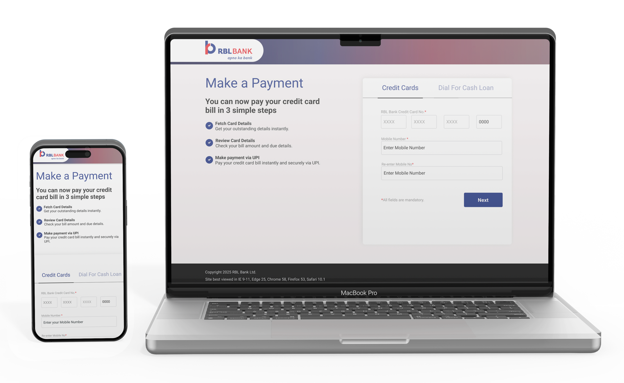
RBL Bank Make a Payment — shown on MacBook Pro and iPhone
Design principles
🔐
Trust first
Every interaction must build confidence before it builds features
🗂
Progressive disclosure
Show only what the user needs at each moment — nothing more
🛡️
Resilient by design
Edge cases and error states get the same care as the happy path — that's where trust is actually earned
📱
Responsive-first
Mobile and desktop flows designed in parallel, not adapted after
Process
ResearchCompetitive audit · Support log analysis
Insights6 key trust signals identified
Architecture3 journeys mapped and validated
Design & TestingUAT across 3 cycles, 4 defects resolved
LaunchShipped · Self-service UPI live
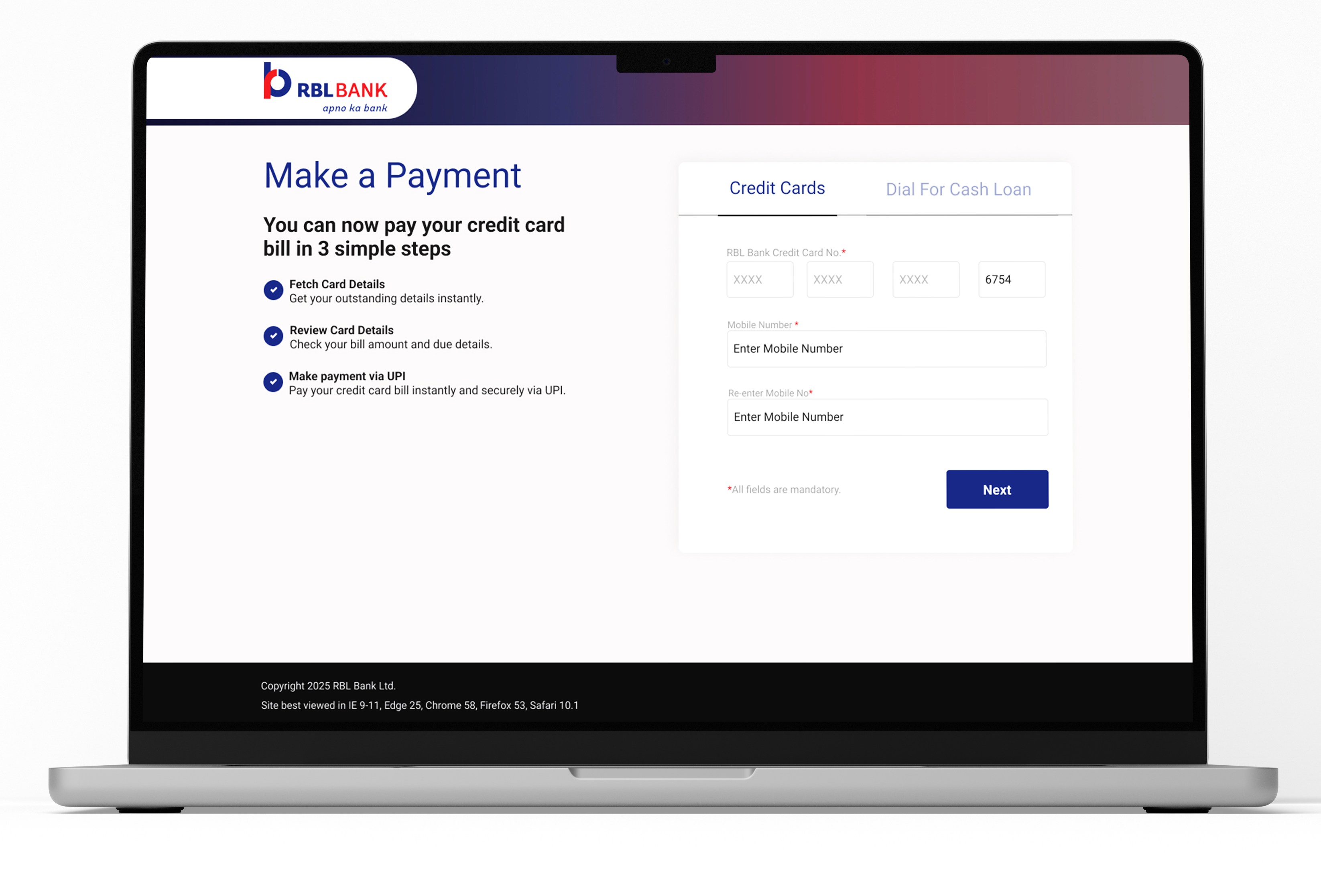
UPI payment flow — desktop mockup showing step 1
Before: Net Banking + Debit Card only After: UPI launched
01
Why This Project Existed
New product capability — not a redesign

This wasn't an optimization. It was a launch.

Before this project, RBL Bank credit card customers had limited options for paying their bill online — internet banking or another bank's debit card. UPI, the payment method most of them used for everything else in their daily lives, wasn't available on the RBL website at all.

The business opportunity was clear. The customer need was urgent. What wasn't clear was the complexity hiding inside what sounded like a simple request: "Add UPI as a payment option."

Why Now

With UPI becoming India's preferred digital payment method — processing over 10 billion transactions a month by 2022 — customers increasingly expected credit card payments to be as seamless as everyday UPI transfers. Paying a credit card bill by calling a helpline felt like a generation behind. The business saw a narrow window to build this capability before it became a competitive liability.

Customer Problems
  • No in-bank UPI channel — forced to leave the RBL ecosystem to pay their own credit card bill
  • No clarity on payment options — outstanding, minimum, and custom amounts were equally confusing
  • Zero payment status feedback — customers couldn't tell if their money had left their account
  • Credit Card and STPL loan payments were impossible to distinguish — wrong payments happened constantly
  • Zero-balance states showed blank screens — customers assumed something was broken and called support
Business Problems
  • No bank-owned UPI surface — customer relationships and payment data lived on competitor platforms
  • High support volume from payment confusion, zero-balance misunderstandings, and STPL mix-ups
  • Digital adoption lagged — routine bill payments were driving branch visits and call center load
  • No scalable framework — every new loan or payment product would need to be rebuilt from scratch
  • STPL and Credit Card journeys were blended in legacy flows, creating compliance risk and complaints

Before designing anything new, I needed to see exactly what customers were working with. Here's what existed — and what this project replaced it with.


02
Product Evolution

How we transformed an existing payment experience by introducing native UPI.

Before this project, customers could only pay through Net Banking and Debit Card via third-party gateways. This project introduced a native UPI payment option while preserving the existing payment experience — letting customers use a faster, more familiar payment method without disrupting workflows they already knew.

"The existing payment journey depended heavily on third-party gateways — limiting ownership of the customer experience and excluding the fastest-growing payment ecosystem in India."

Existing Experience — no UPI option

What customers were working with

Two payment methods, both routed through third-party gateways the bank didn't own.

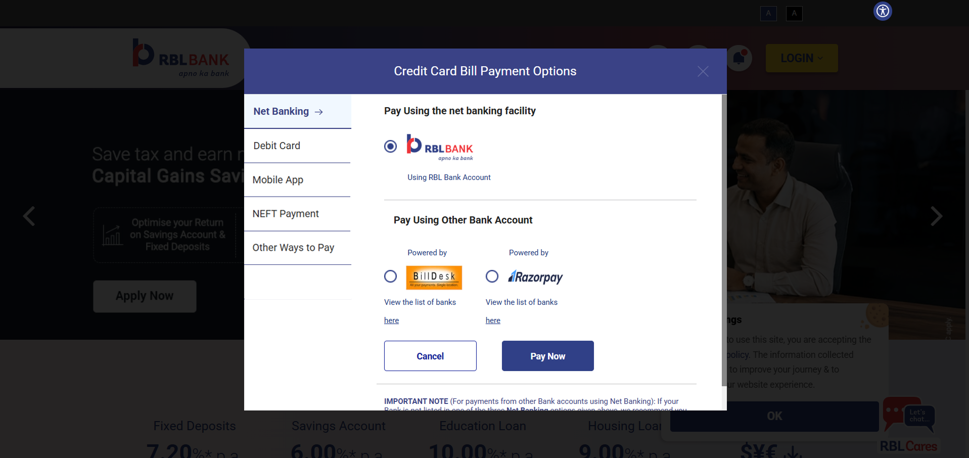
Net Banking Before — RBL Bank credit card payment options showing Net Banking tab selected, using BillDesk and Razorpay gateways
Card 1 — Net Banking

Fragmented, off-brand, and slow to trust

Customers had to route through RBL's net banking or a third-party gateway (BillDesk/Razorpay) just to pay their own credit card bill. Every extra redirect was a moment for a customer to abandon the payment — and a moment RBL didn't control.

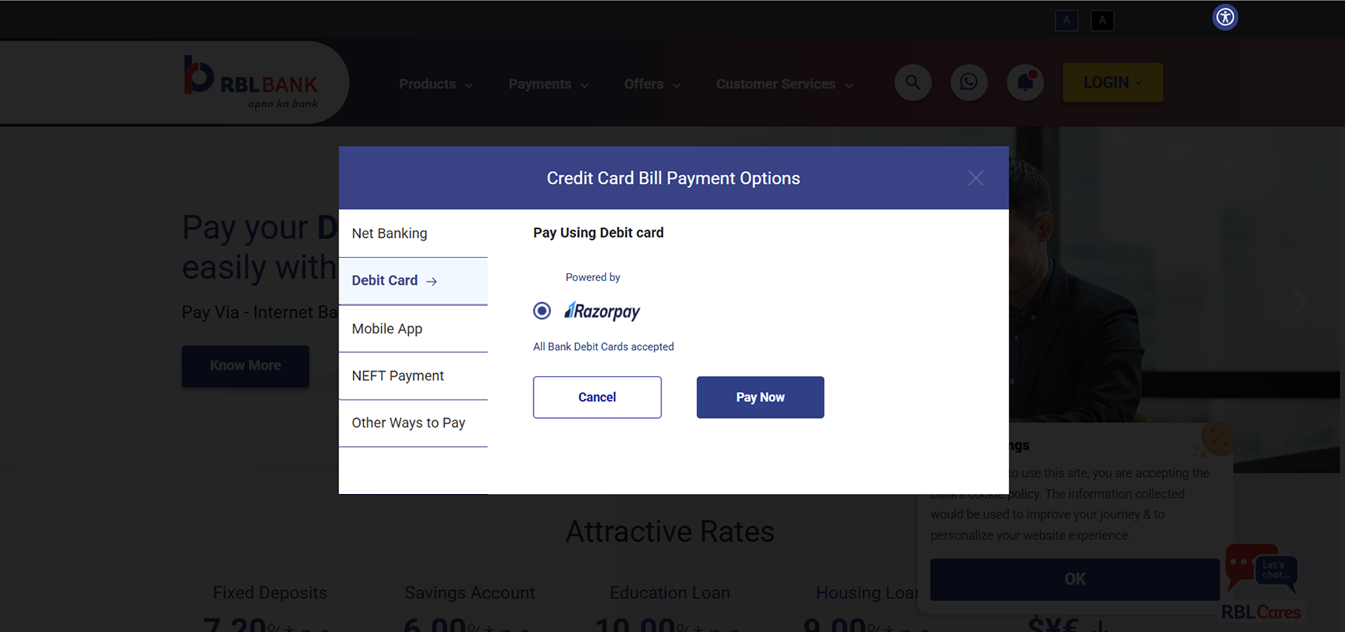
Debit Card Before — Debit Card tab selected, Razorpay powered, accepting all bank debit cards
Card 2 — Debit Card

Someone else's payment relationship

This path was powered entirely by Razorpay, accepting any bank's debit card. Functionally it worked — but RBL had zero ownership of the payment relationship, the data, or the experience at the exact moment money changed hands.

Instead of replacing the existing payment experience, we extended it. The goal was to preserve familiarity, reduce learning effort, introduce a modern payment method, minimize engineering scope, and keep existing customer behavior intact — all at once.

My Solution — UPI is now an option

Native UPI, integrated into the existing payment journey.

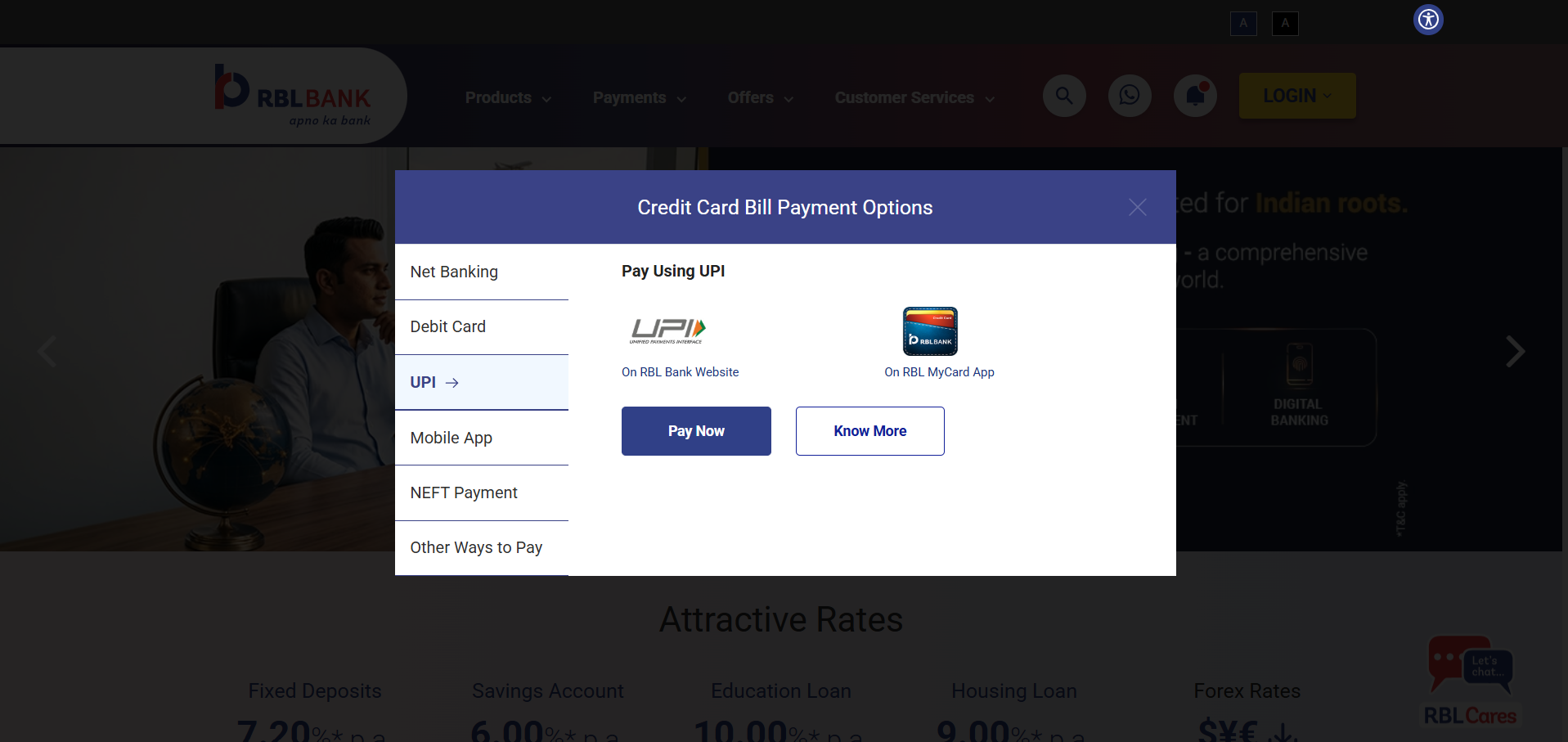
Instead of redesigning the entire modal, I introduced a dedicated UPI tab inside the existing payment navigation. Customers immediately understood the interface because nothing familiar disappeared — the experience evolved instead of being replaced.

Current experience — Net Banking and Debit Card only, no UPI option Redesigned experience — native UPI tab added to the same modal Current Experience Redesigned Experience
Drag to compare
UPI tab — launched by this project

The same modal, the same left-nav, the same customers — but now with a UPI tab that didn't exist before. This is the 0→1 moment.

New UPI tab, positioned inside the existing navigation — not bolted on as a separate flow
Existing navigation preserved exactly — Net Banking and Debit Card stayed where customers expected them
Native payment flow — both On RBL Website and On RBL MyCard App options, no third-party redirect
Familiar Pay Now / Know More pattern, matching every other tab in the same modal

Key Improvements

Design Decisions

Extend the existing modal, or design a standalone UPI experience?

Why extend, not redesign

A standalone UPI flow could have been more "on-brand" for the new method, but it would ask every customer — including the ones who'd used Net Banking for years — to relearn a payment interaction. That cost outweighed the benefit.

Why familiarity mattered

Payment moments are trust moments. Introducing unfamiliar UI at the exact point money changes hands increases hesitation and abandonment — the opposite of what a faster payment method should do.

Engineering considerations

Extending the existing tab structure meant reusing the modal's routing, validation, and state-handling logic instead of building a parallel system — a smaller, lower-risk scope that shipped faster.

Business alignment

Progressive enhancement let the business ship the highest-priority capability — UPI — without a large-scope redesign project competing for the same engineering quarter.

UX Principles Applied

Recognition over Recall

Customers recognized the extended navigation instantly — no new pattern to remember.

Consistency

UPI followed the same tab, layout, and CTA conventions as every other payment method in the modal.

Progressive Enhancement

The core experience worked exactly as before; UPI layered on top without breaking anything.

Progressive Disclosure

UPI details only appear once a customer selects that tab — no added complexity for everyone else.

Visual Hierarchy

Pay Now stayed the clear primary action; the new option never competed for attention with existing ones.

User Control

Customers keep full choice between Net Banking, Debit Card, and UPI — nothing was taken away.

Fitts's Law

Primary actions (Pay Now, Know More) kept consistent size and position across every tab for fast, confident targeting.

Cognitive Load Reduction

Reusing an existing mental model meant zero onboarding cost for a brand-new payment method.

Information Architecture

UPI slotted into the existing left-nav hierarchy exactly where customers would look for a new payment option.

What this evolution made possible

Business Impact
Expanded digital payment capabilities without a ground-up rebuild of the payment modal
Improved ownership of the customer experience at the exact moment money changes hands
Reduced reliance on third-party payment providers for the fastest-growing payment method in India
User Impact
Gained a faster, more familiar payment option — the same one they already use for everything else
Maintained familiarity — nothing about the existing Net Banking or Debit Card flow changed
Reduced friction and hesitation by avoiding third-party redirects for the new UPI path
Design Impact
Extended an existing system instead of rebuilding it — smaller scope, faster ship, lower risk
Created a scalable payment framework ready for future methods beyond UPI
Established a reusable "extend, don't replace" interaction pattern for future feature launches

Understanding what shipped was one thing. Understanding why users still hesitated at the moment of payment required getting into their heads directly.


03
Research Insights

Users don't care about UPI. They care about certainty.

Two weeks of competitive analysis across GPay, PhonePe, CRED, Paytm, and five banking apps — supplemented by support call log review and stakeholder interviews. The pattern was the same everywhere. This wasn't a feature problem. It was a trust problem.

Insight 01

"Did my payment go through?"

That's the only question users are asking during a payment. Design response: every screen had to answer this question — proactively, not reactively.

Insight 02

Trust breaks in the 30–90 second gap after QR scan.

This silent window — between scanning and confirmation — is where anxiety spikes. Design response: fill the gap with a visible timer and clear progress context.

Insight 03

Clarity beats feature richness, every time.

Apps with fewer features but immediate, specific feedback outperformed richer apps with ambiguous states. Design response: ruthlessly simplify each screen to one job.

Insight 04

Zero-balance was the #1 avoidable support trigger.

Customers with ₹0 outstanding saw blank amounts, assumed the system was broken, and called support. Design response: proactive state explanation — before the customer wonders.

Insight 05

Blended Credit Card and STPL UI causes wrong payments.

Customers couldn't distinguish between products in a shared UI. The consequences were dispute-level errors. Design response: dedicated journeys, not a toggle.

Insight 06

Slow validation errors feel like bank failures.

A 3-second server-side response to an invalid card number felt like a system error. Design response: client-side validation, immediate and specific — before any API call.

"Payment design is not about the transaction. It's about the confidence the customer feels while making it."

The findings revealed something unexpected. We weren't designing one payment journey. We were designing three — and each one had completely different customer expectations.


04
Design Exploration

Concepts considered before landing on the final direction.

This section is a placeholder — ready for the real concepts explored during this project, not yet filled in.

Placeholder — add real concepts, screenshots, and rejection reasoning here
Concept A
Add screenshot
[Add concept name]
Why explored / why rejected — [add real reasoning]
Concept B
Add screenshot
[Add concept name]
Why explored / why rejected — [add real reasoning]
✓ Final Concept
Add screenshot
[Add concept name]
Why selected — [add real reasoning, or link to the Core Decision section below which already documents the mood-first vs search-first call]

05
Iterations

How the design evolved from first draft to shipped.

This section is a placeholder — ready for real version history and feedback, not yet filled in.

Placeholder — add real version history and stakeholder feedback here
Version 1
[Add screenshot + description]
Feedback
[Add real feedback received]
Version 2
[Add screenshot + description]
Feedback
[Add real feedback received]
✓ Final
[Add screenshot + description, or link to the shipped UPI tab shown above]

06
Three Journeys. One Product.

We weren't designing one payment flow. We were designing three.

What looked like a single payment screen was, beneath the surface, three distinct product experiences — each with different customers, different financial rules, different emotional stakes. Designing them as one would have been the easiest mistake to make, and the most expensive one to fix.

Journey 1 — Credit Card Payment  ·  Standard flow
1
Identify
Card + mobile
2
Review balance
Outstanding first
3
Choose amount
Full / Min / Custom
4
Pay via UPI
QR + 5-min timer
5
Confirm
Receipt + Payment ID
Journey 2 — Zero Outstanding  ·  Graceful exit
1
Identify
Card + mobile
2
Review balance
All amounts = ₹0
Journey ends
With explanation
Journey 3 — STPL Loan Repayment  ·  Separate product
1
STPL entry
Dedicated tab
2
Loan account
15-digit format
3
Review loan
Full / Custom only
4
Pay via UPI
QR or other modes
5
Confirm
Loan receipt

"Three journeys. One entry point. Zero margin for a customer ending up in the wrong one."

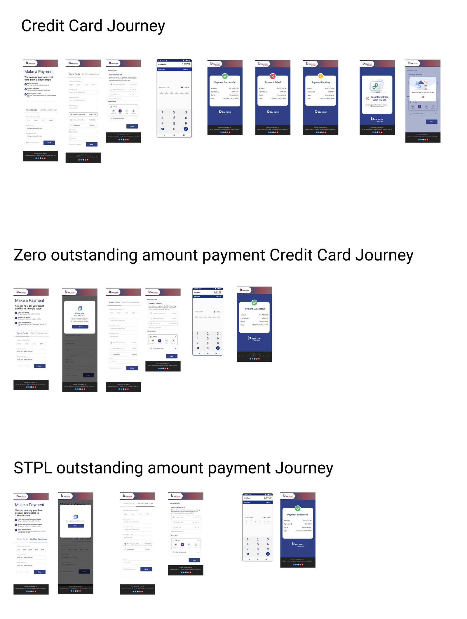
Figma overview
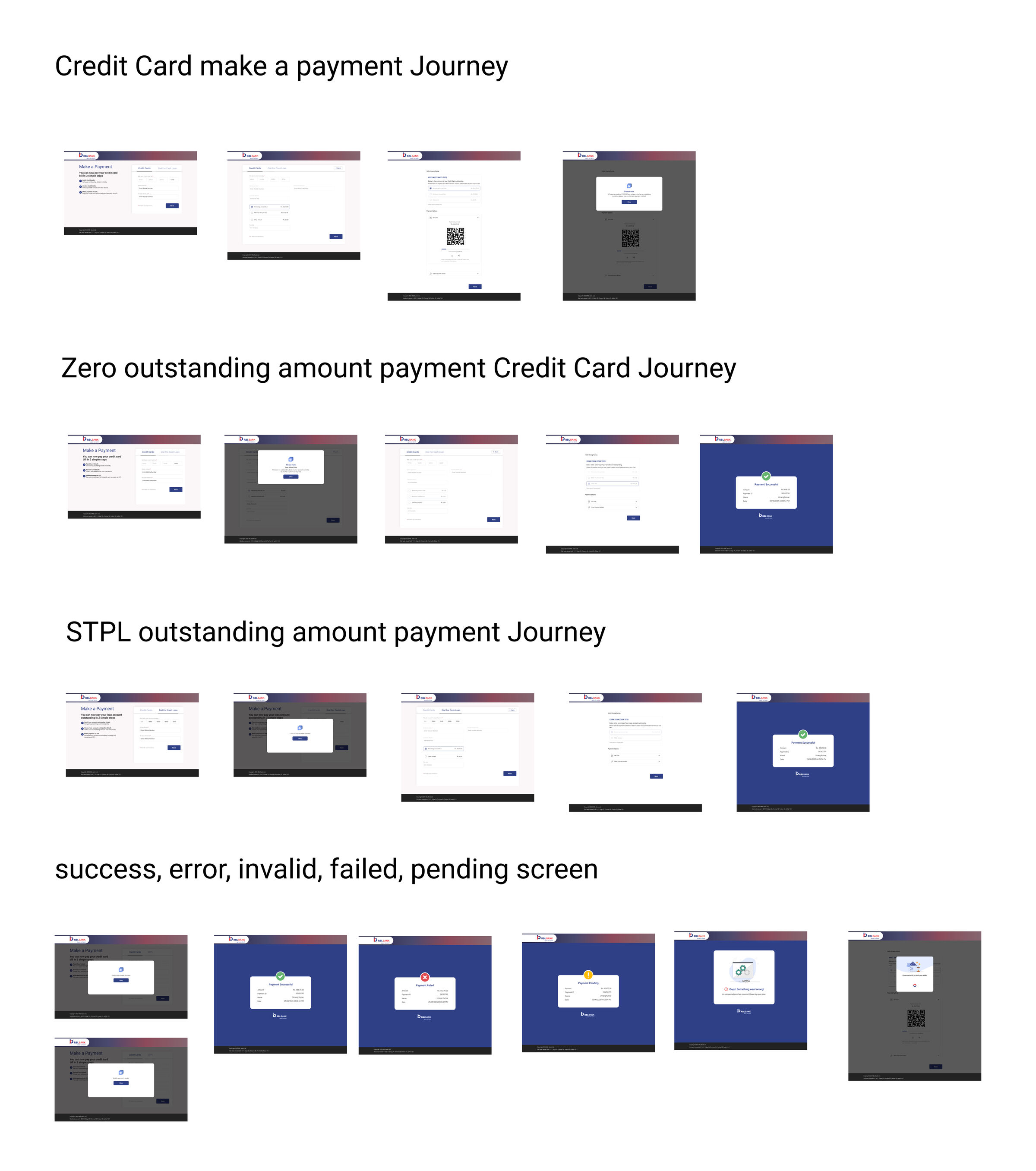
All three journeys mapped — the full design scope at a glance
Desktop journeys
Three payment journeys overview — desktop layout
Desktop · 3 journeys + all state screens

Credit Card make a payment · Zero outstanding · STPL outstanding · Success, error, invalid, failed, pending states.

Mobile journeys
Three payment journeys overview — mobile layout
Mobile · 3 journeys

Credit Card Journey · Zero outstanding · STPL outstanding — responsive design from the start, not a mobile afterthought.

Designing the happy path was relatively straightforward. The real product thinking emerged when we had to make the hard calls — the ones with real trade-offs.

07
A Design Decision That Changed Everything

Why we chose QR over UPI deep linking — and why it mattered.

Early in the project, we faced a foundational technology decision that would shape the entire payment experience. It wasn't a visual design choice. It was a product architecture choice with downstream consequences for trust, conversion, and technical risk.

The Core Decision

How should users initiate a UPI payment — via a QR code displayed on screen, or via deep linking that opens their UPI app automatically?

Problem

The payment had to be initiated via UPI, but there were two technical paths. Deep linking felt like the smoother UX — one tap, UPI app opens, payment completes. But the platform constraints were significant.

Options Considered

Option A: UPI deep linking — automatic app redirect on tap.

Option B: QR code display — customer scans from any UPI app on any device.

Trade-offs

Deep linking required native app API integrations that our responsive web platform couldn't guarantee across Android, iOS, and browser combinations. A broken deep link mid-payment is more trust-damaging than a QR. QR is universal — no integration dependency, no device-specific failures.

Decision + Outcome

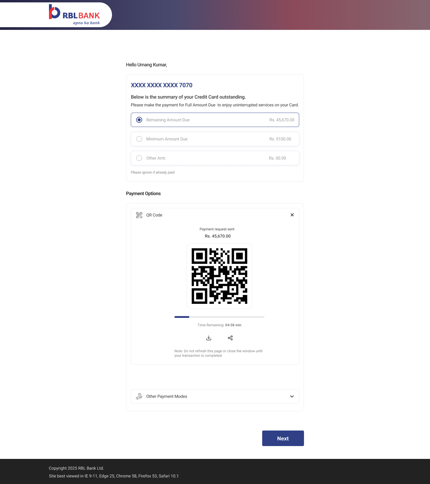
QR code. Lower technical risk, universal compatibility, and — critically — QR enables the 5-minute countdown timer that deep linking can't support. That timer became one of the most important trust signals in the entire experience.

The QR payment screen — direct output of the QR architecture decision, showing countdown timer at 4:58

The screen this decision produced — with the countdown timer that deep linking could never have supported.

"The best design decisions at this project weren't made in Figma. They were made in a room with engineering, asking: what can we actually trust to work for every user, on every device, every time?"

With the architecture decided, it was time to design the core experience — four screens, each with a single job, and no room for ambiguity.


Interactive Prototype

Explore the full payment experience.

All three journeys are accessible from the starting screen. Click through to experience how the payment flow, edge cases, and failure states work together as a connected product.

You can also explore this prototype directly in Figma.

Open interactive prototype ↗

08
Main Payment Journey

Four screens. Every pixel intentional.

Each screen had exactly one job. The design removed everything that didn't serve the customer's most urgent need at that moment — and added everything that reduced uncertainty. Screens below support the story. They don't tell it.

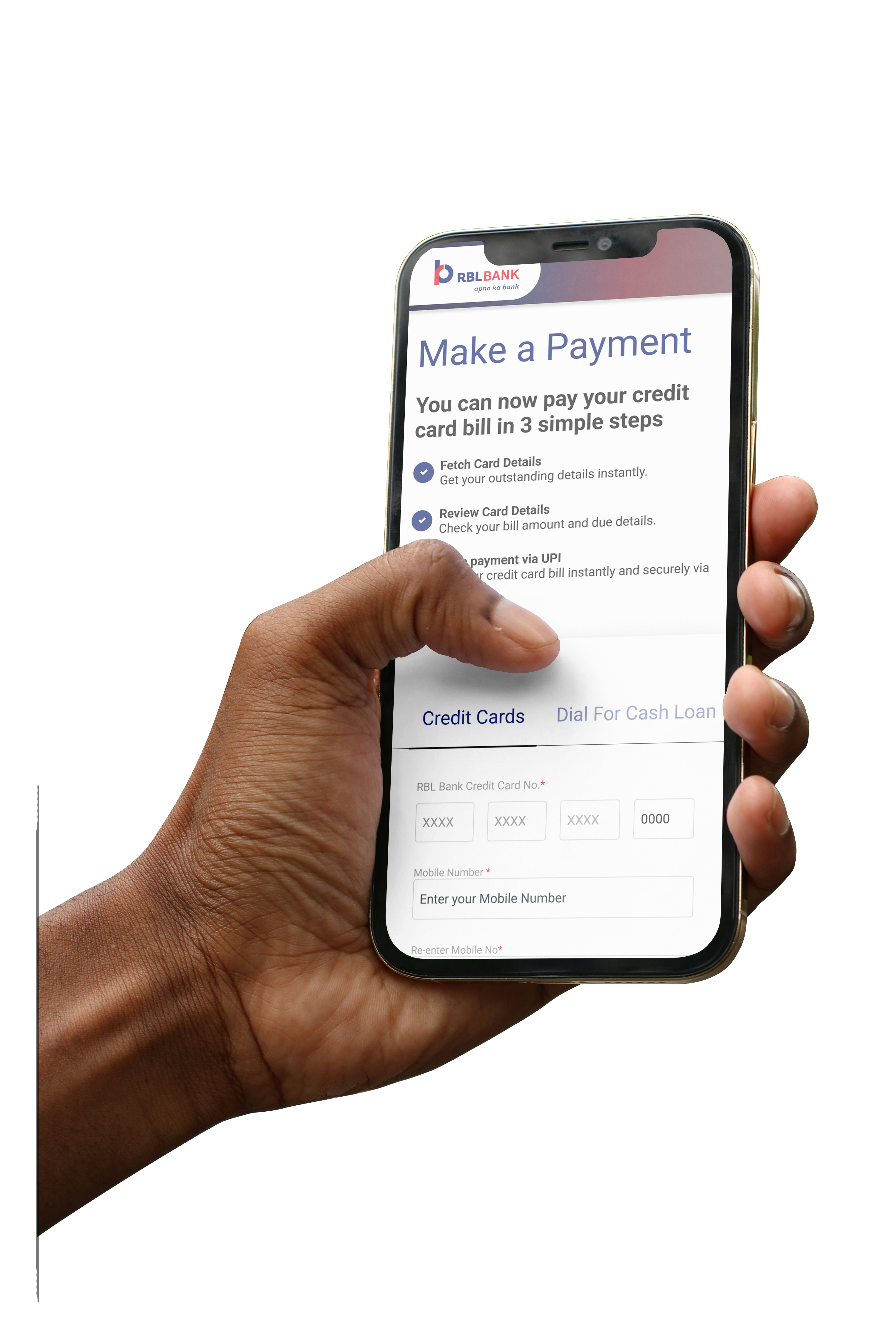
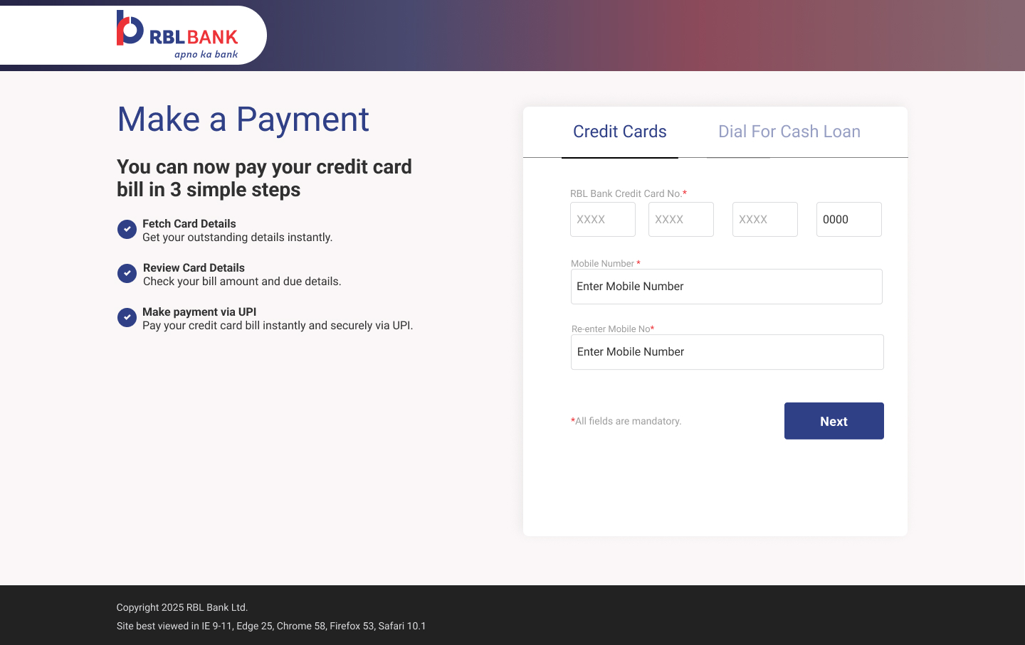
Step 1: Credit card payment entry shown on iPhone held in hand — Make a Payment screen with 3-step process guide and card number fields
Problem

Customers arrived with no context. Cold entry into a banking form felt unfamiliar and risky — especially on a web page the bank had never offered before.

Decision

Show the 3-step process before any data entry. Fetch → Review → Pay. Expectations set, RBL's ownership of the experience established, perceived risk reduced — before a single digit is typed.

Outcome

Trust signals before commitment. Customers understood the journey before they were inside it.

Problem

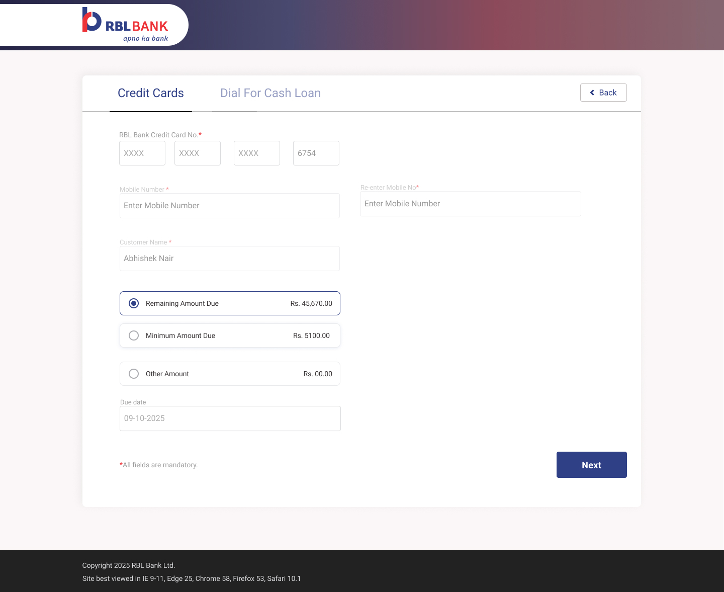
Three payment options — full outstanding, minimum due, custom amount — each with different financial consequences. No default, no guidance. The result: decision paralysis and wrong-amount payments.

Decision

Outstanding balance shown first. Remaining Amount Due pre-selected. Nudge toward full repayment — healthier for the customer's account — while keeping all choices accessible. Due date surfaced in context, not buried.

Outcome

Wrong-amount payments reduced. The pre-selection guided toward the financially better choice without removing agency.

Step 2: Amount selection — Remaining Amount Due Rs 45,670 pre-selected, Minimum Due Rs 5,100, Other Amount as alternatives
Step 3 — The most anxious moment in the journey
Step 3: UPI QR code — payment request Rs 45,670, countdown timer 4:58 minutes, download and share options below QR
Problem

UPI QR expires in 5 minutes — invisible to the user. Refreshing the page voided the entire session and required starting over.

Decision

Visible countdown timer from the moment QR appears. "Do not refresh" warning in context. Download + share for device-switchers — eliminating the need to refresh.

Outcome

Customers knew exactly how long they had. Urgency without panic. The silent waiting gap between scan and confirmation now had a voice.

Step 4 — Every outcome gets a receipt
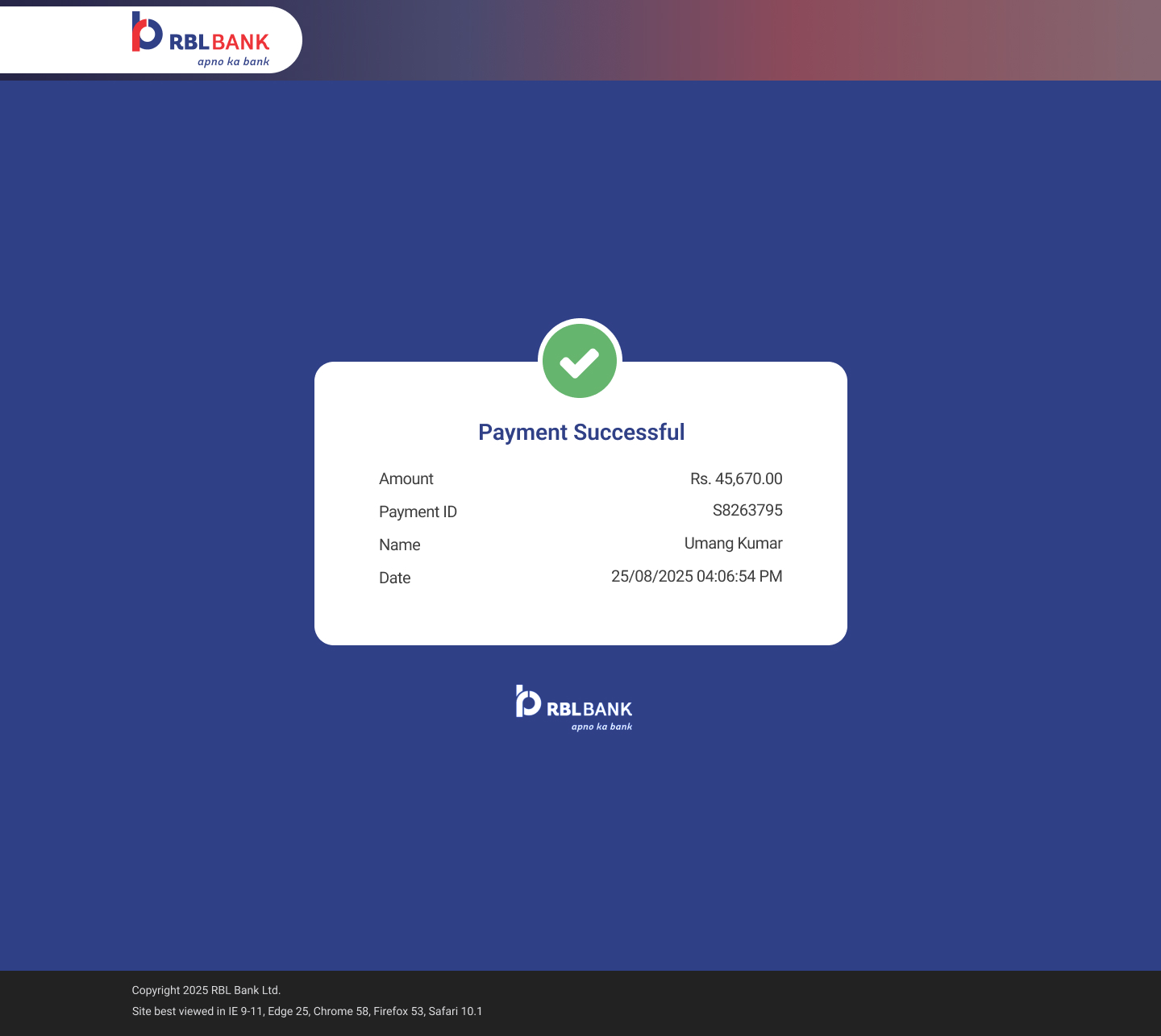
Payment Successful — green checkmark, amount Rs 45,670, Payment ID S8263795, name and timestamp
✓ Success

Complete receipt. Amount, Payment ID, timestamp. Nothing left to wonder about.

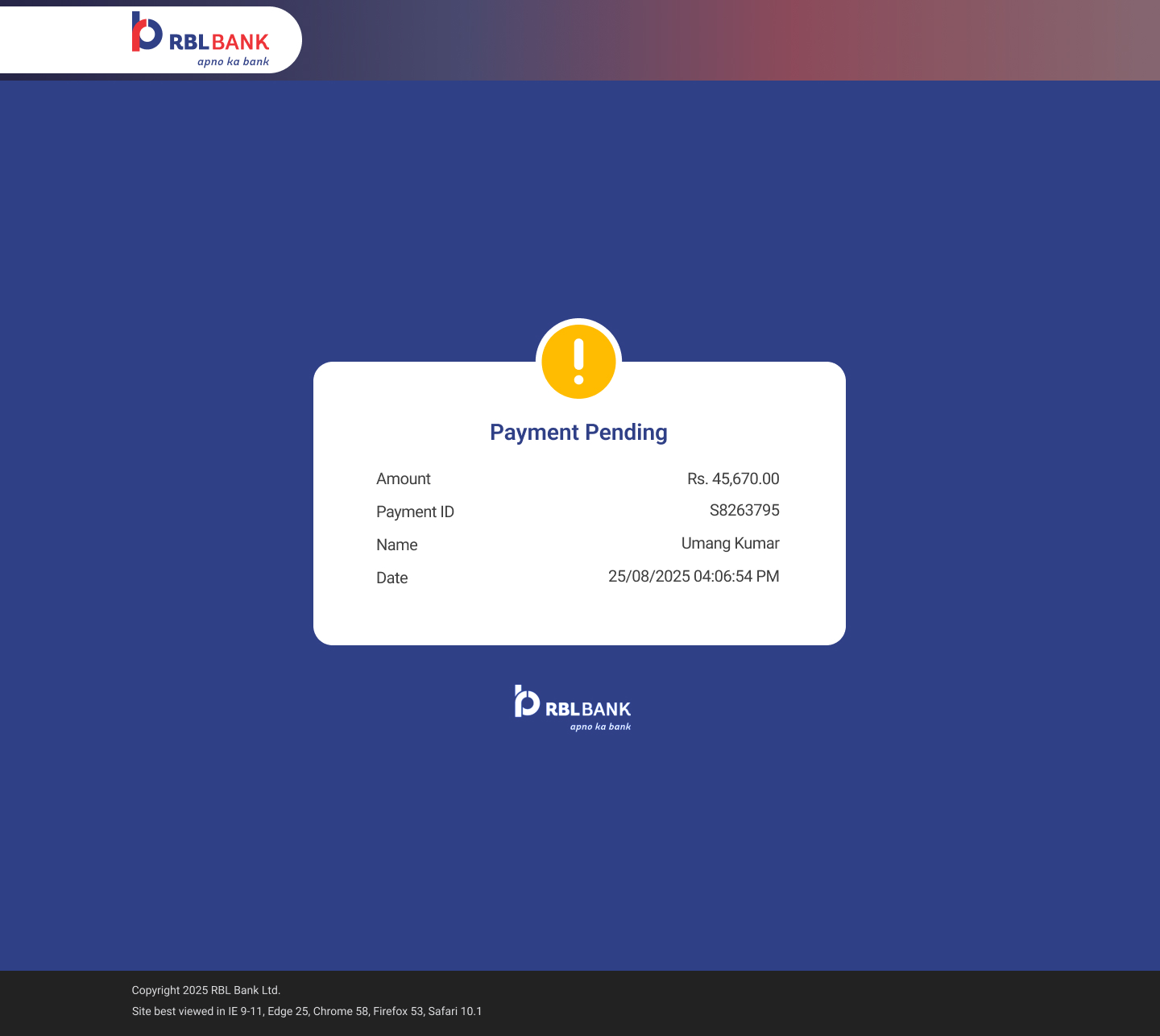
Payment Pending — amber warning icon, same transaction details preserved for reference
⏳ Pending

Payment ID preserved. "Allow 24 hours." Wait, but don't panic — the bank has it.

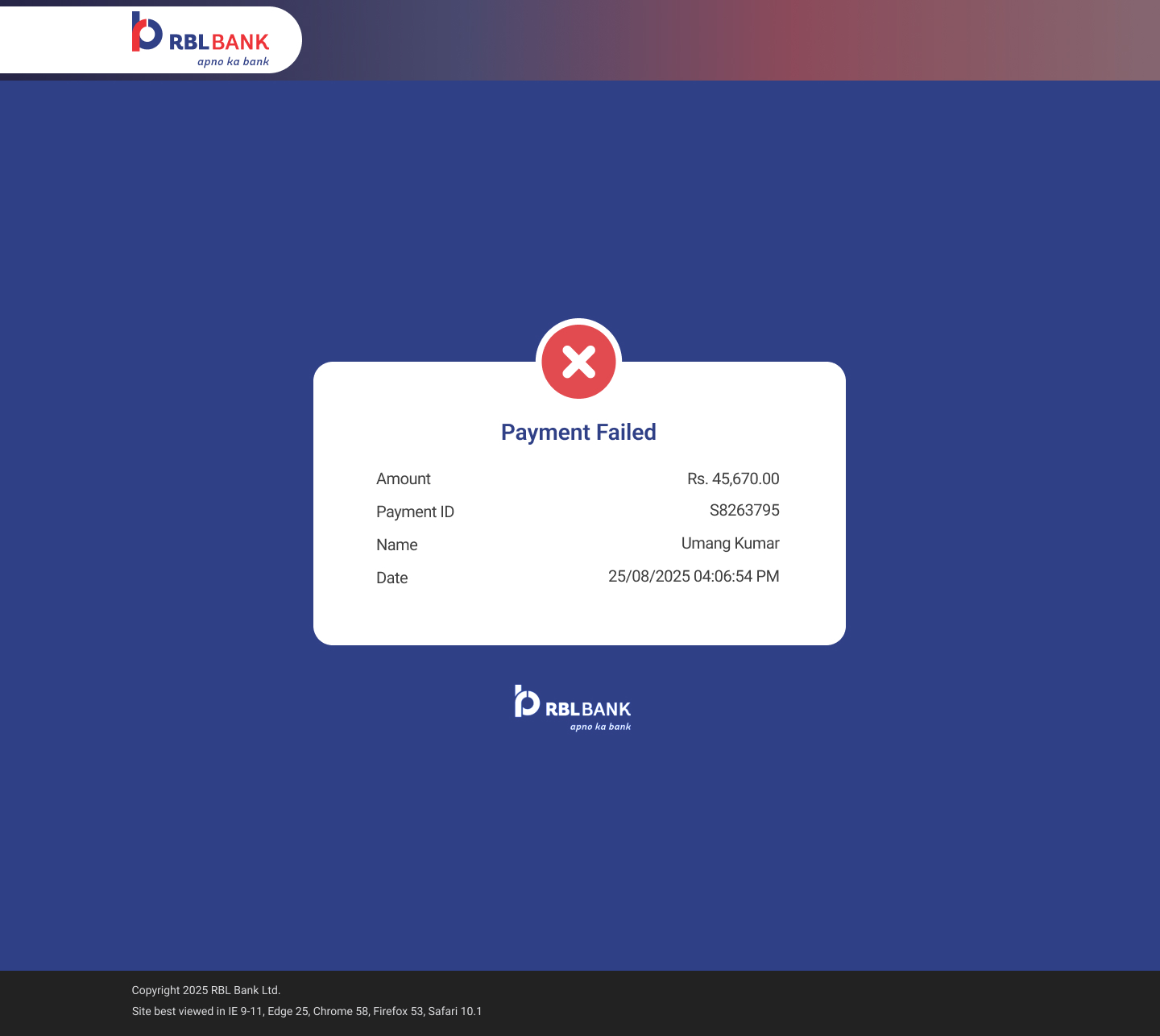
Payment Failed — red X icon, same layout, Payment ID still shown for dispute reference
✕ Failed

Dispute evidence preserved even at the worst moment. The failure screen became a self-service recovery tool.

Design decision: All three states use identical layout — same card, same fields, same position. Only the icon color and heading change. This consistency means customers never have to learn a new UI when things go wrong. The structure is a trust signal.

Designing the happy path was the straightforward part. The real product thinking began when customers didn't follow it.

Screen recording Now that you've seen each screen — watch all three journeys as a connected experience

09
Edge Cases

The happy path was easy. The real work started here.

In financial products, edge cases aren't rare — they're predictable. The quality of a payment product isn't measured by how it handles success. It's measured by how it handles everything that can go wrong before, during, and after.

6a
Zero Outstanding — When Nothing to Pay Still Needs Design

A payment experience for customers who don't need to make a payment.

Zero-balance customers were the single largest driver of avoidable support calls in the legacy system. They arrived ready to pay. They saw amounts showing ₹0.00 with no explanation. They assumed the system was broken. They called the helpline. The helpline told them their balance was zero. The customer felt confused, then embarrassed.

The fix wasn't a backend change. It was a UX decision: explain the account state before the customer has to wonder about it. A graceful exit, not a dead end.

"Good design isn't always helping users take action. Sometimes it's helping them understand why no action is needed."

Zero outstanding entry — identical to standard flow, customer has no reason to expect what comes next
Step 1 — identical entry, zero signal

Customers begin exactly as they would in a standard payment. No indication that anything is different — the surprise arrives on the next screen.

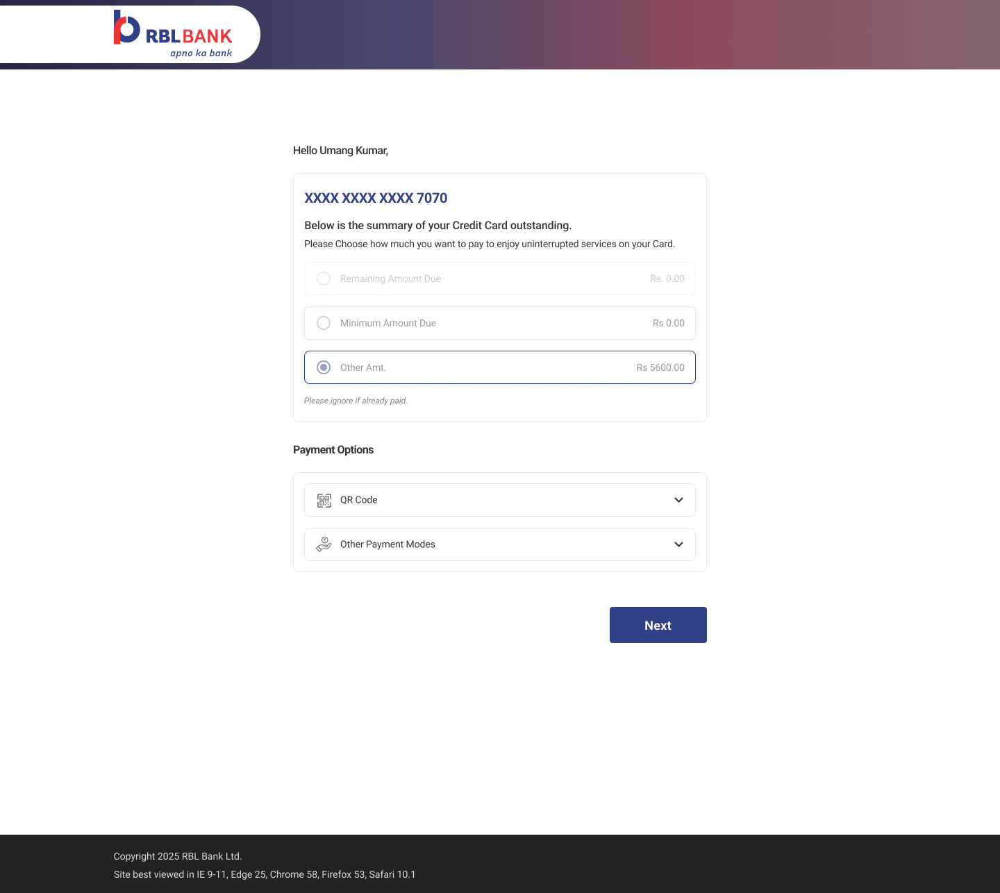
Zero outstanding — Rs 0.00 for all primary amounts, Other Amount Rs 5600 selected, 'Please ignore if already paid'
The reveal — graceful, not broken

"Please ignore if already paid." Six words that replaced a support call. Instead of a blank dead end, an explanation and a dignified exit.

6b
Regulatory Limit — Proactive, Not Reactive
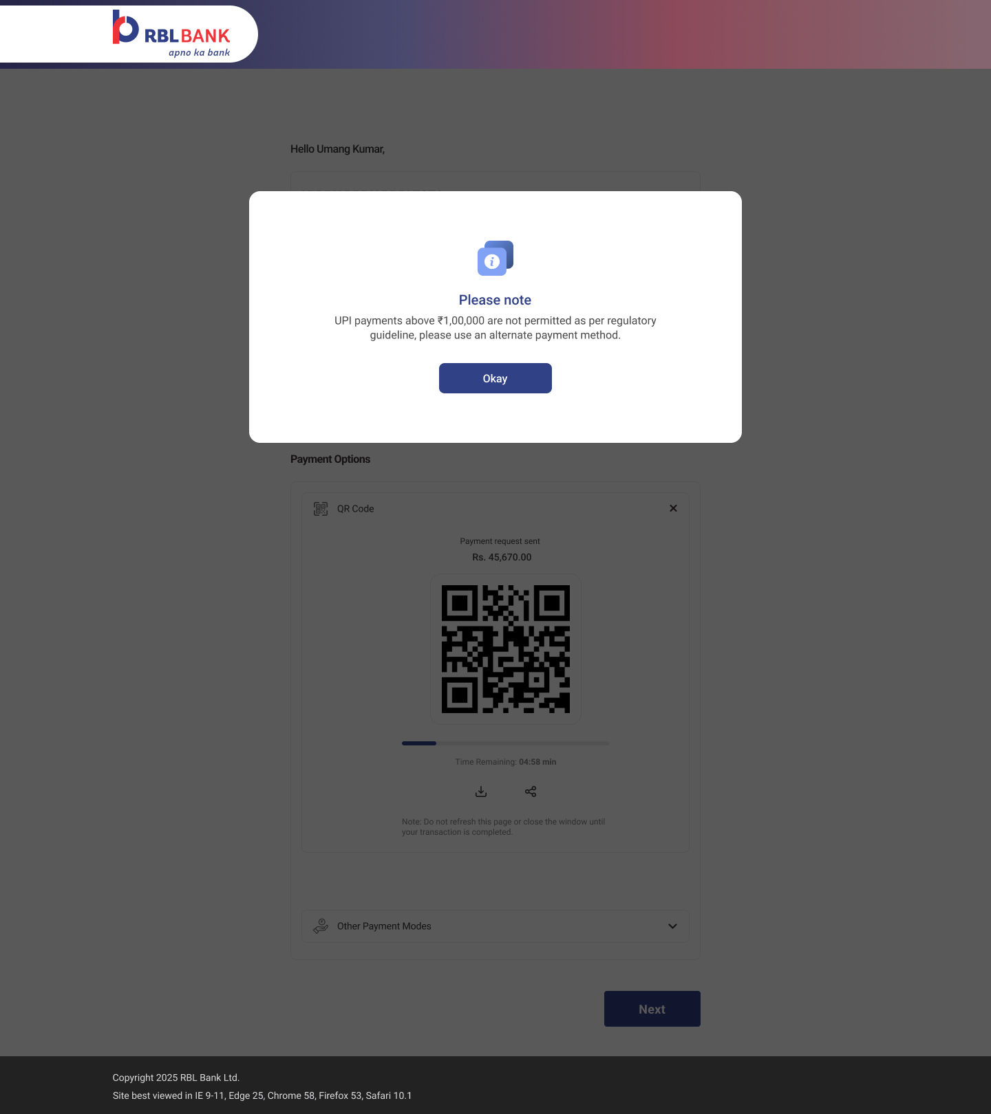
UPI limit modal — UPI payments above Rs 1,00,000 not permitted per RBI regulatory guideline, Okay

RBI limits UPI to ₹1 lakh. Most apps discover this after the QR is scanned.

When a customer tries to pay above ₹1,00,000 via UPI, the default experience in most apps is a cryptic decline — after the QR has been generated, possibly scanned, and the customer is already waiting for confirmation.

We surfaced the constraint before QR generation: clear RBI language, the specific limit, and what the customer should do instead. A trust-building detour rather than a trust-breaking dead end.

6c
Validation & System States — Every failure scenario, designed
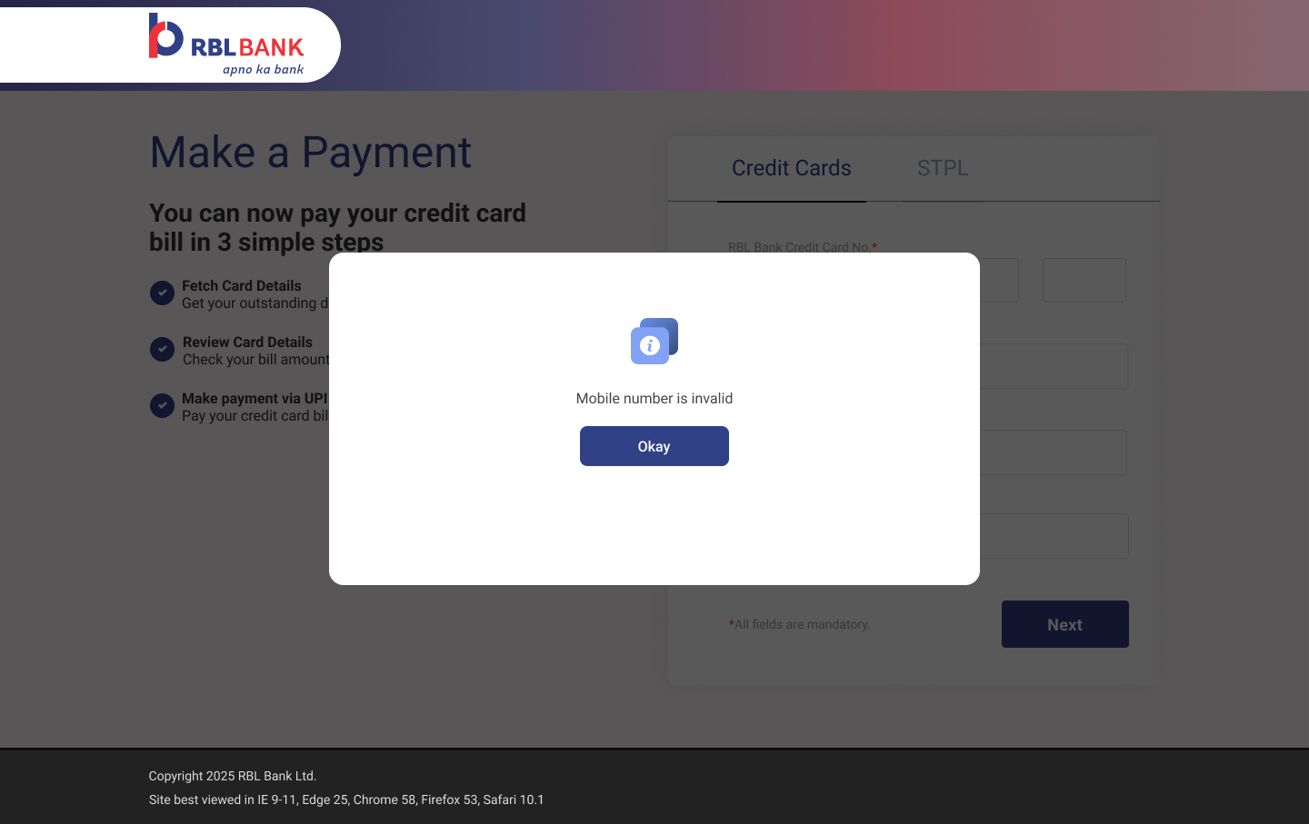
Invalid mobile number modal — immediate client-side feedback, specific error message, single Okay CTA
Validation — mobile

"Mobile number is invalid." Client-side, immediate, specific. No API call. No 3-second wait that feels like a server failure.

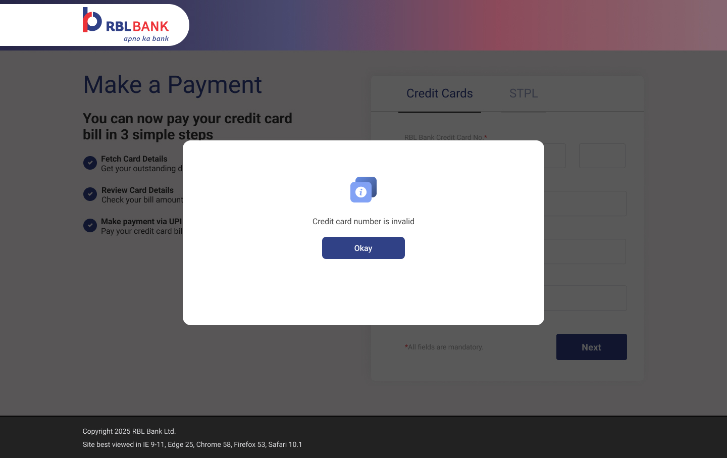
Invalid credit card number modal — same consistent modal pattern as mobile validation
Validation — card number

"Credit card number is invalid." Same modal pattern. Consistent behaviour is a trust signal — customers learn once, apply everywhere.

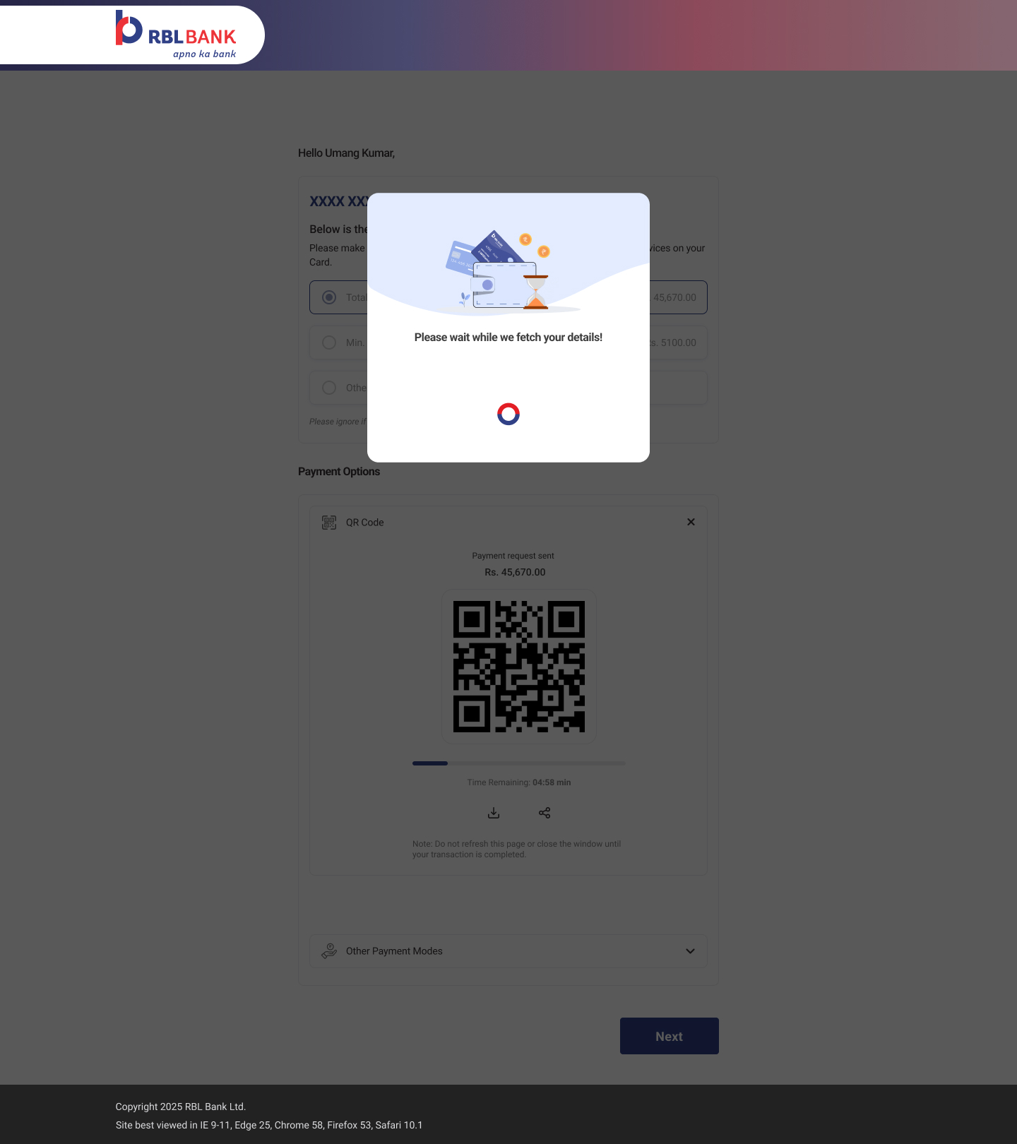
Loading state — Please wait while we fetch your details, illustrated hourglass, spinner
Loading state

"Fetching your details." A loading screen that explains itself. Replaces the blank white delay that customers assumed was a crash.

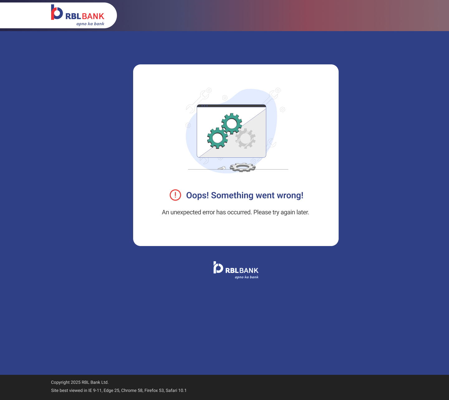
System error — illustrated gears, Oops something went wrong, please try again later
System-level failure

When the bank's systems fail, the UX still has a job to do.

An illustrated error state with plain language — "Oops! Something went wrong. Please try again later." No technical codes, no red alarms, no blame. Empathy as a design decision. The illustration signals that this is a known, handled state — not a broken experience.

"A good error screen tells the user three things: what happened, that it's not their fault, and what to do next."

Edge cases covered. But we still had to solve the hardest product architecture decision of the project — whether STPL deserved its own experience entirely.


10
STPL Complexity

The decision that looked like a UX call was actually a product call.

Unlike standard credit card payments, STPL customers had completely different repayment expectations, different account formats, and different validation requirements. Reusing the standard payment experience would have created persistent confusion and increased support dependency — the exact problem we were trying to solve.

The question wasn't how to style a toggle between the two products. The question was whether STPL deserved its own journey — its own entry point, its own fields, its own rules.

It did. And we built it.

Credit Card Payment
Account format16-digit card number
Payment optionsFull / Minimum / Custom
Minimum dueYes — statement cycle
Entry point"Credit Cards" tab
Wrong product paidCard balance clears
STPL Loan Repayment
Account format15-digit loan account
Payment optionsFull / Custom only
Minimum dueNo — loan schedule
Entry point"Dial For Cash Loan" tab
Wrong product paidSTPL stays unpaid — dispute
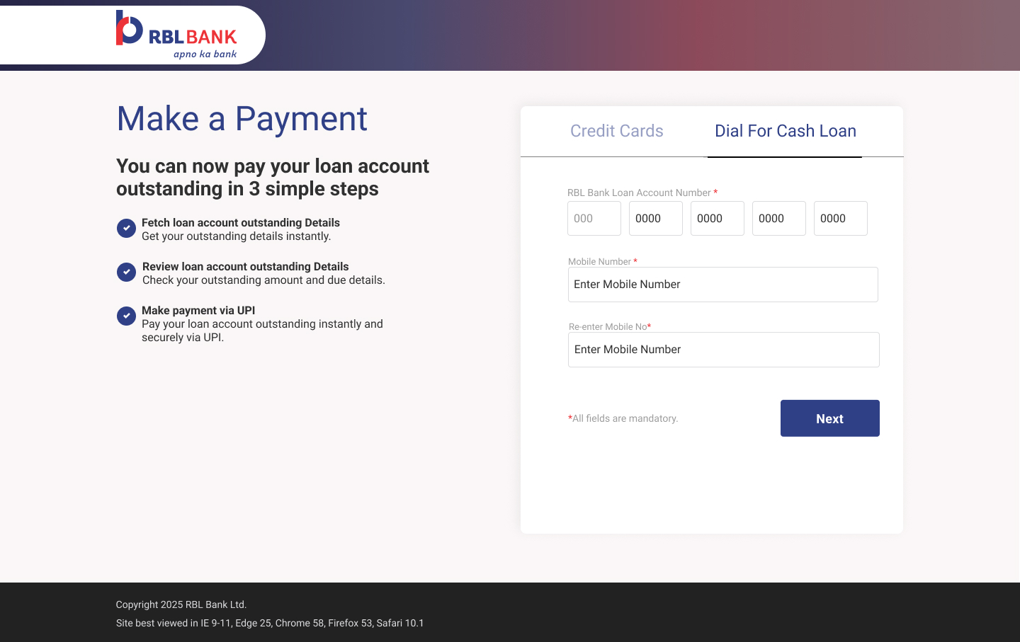
STPL entry — Dial For Cash Loan tab active, loan account number fields, 3-step loan repayment guide
Dedicated entry point

A separate tab creates a hard mental boundary. Customers know which product they're paying before entering a single digit.

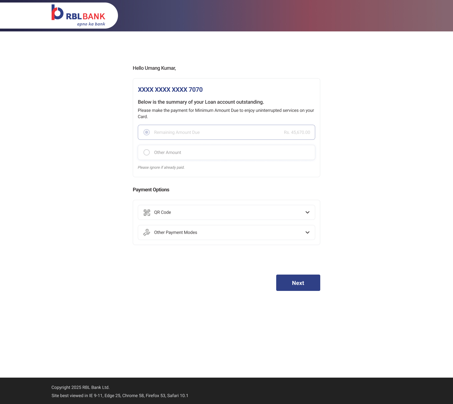
STPL amount selection — loan outstanding summary, Remaining Amount Due only, no minimum due option
Simplified, accurate choice set

No minimum due option — because STPL doesn't support it. The UI reflects the product's actual rules, not a copy-paste of the credit card flow.

"The best decision in this section wasn't about how the screens looked. It was deciding that STPL needed its own journey at all."


11
Engineering Collaboration

The countdown timer wasn't my idea. It came from an engineer.

In week two, an engineer mentioned offhand that UPI QR codes expire after 5 minutes during an API response discussion. That single comment became one of the most important UX decisions in the product — a visible countdown timer that dissolved the highest-anxiety moment in the entire payment journey. That's what happens when design is present in engineering conversations, not just at handoff.

Phase 1
API Response Mapping

Engineering mapped all available API fields in week 1 — including which payment status responses were synchronous and which were asynchronous. This determined the pending state design and recovery path before any wireframe was drawn.

Phase 2
Validation Logic Reviews

Weekly design-engineering syncs on validation rules before any screen went to high-fidelity. QR download required a new API endpoint — scoped and built in sprint 3 after the design case was made with user context.

Phase 3
Payment State + Timeout Handling

QA surfaced two undocumented edge states during UAT: a session hang when the bank API timed out mid-load, and a race condition on the pending → failed state transition. Both were designed and resolved before release.

Phase 4
UAT Support

Participated in all three UAT cycles across all three journeys. Raised 4 UI-level defects found during live testing that weren't in the written spec. Design was present through delivery — not just at handoff.


12
Impact

What the product made possible

Before this shipped, RBL Bank credit card customers could only pay their bills online via internet banking or another bank's debit card. UPI — the payment method they used for everything else — wasn't an option on the RBL website at all. After this shipped, it was.

Product Impact
Introduced UPI as a payment method on the RBL Bank website for the first time — previously customers could only pay via internet banking or another bank's debit card
Established a reusable payment design framework — journey architecture, edge case patterns, and failure states directly applicable to future EMI, BNPL, and loan repayment products
Separated STPL loan repayment and Credit Card payment into distinct product journeys — eliminating wrong-payment errors and the compliance overhead they created
Customer Impact
Customers could now pay their credit card bill via UPI directly on the RBL website — a faster, more familiar method they were already using for everyday payments
Zero-balance customers received a clear explanation instead of a blank screen — resolving the most common reason they were calling support unnecessarily
Every payment outcome — success, pending, or failed — now showed a full transaction receipt with Payment ID, so customers had what they needed to act without calling anyone
Business Impact
Added UPI as a new payment channel on the RBL website — expanding digital payment options beyond the existing internet banking and debit card methods
Reduced avoidable support calls — zero-balance confusion and payment status uncertainty were the top drivers, both addressed through proactive design rather than backend changes
Shipped fully compliant at launch — all RBI UPI guidelines surfaced proactively in the UI, STPL copy reviewed and approved by legal, zero compliance gaps at go-live

Three months after launch, the customer care team described the change in support patterns: "We're getting fewer calls about payment issues. And when customers do call, they already understand what happened — they're asking a specific question, not reporting that the page looks broken."

That second part mattered as much as the first. The zero-balance confusion and blank-screen panic that had driven the most avoidable calls were gone — not because of a backend fix, but because the UI finally explained what it knew.

Next Case Study
Dineout App — UI/UX, Research, Prototype →